Staff Product Designer · 2025–Current · Consumer Mobile
Fizz
Fizz is an anonymous social platform for college students—real-time feeds tied to specific universities where students can share their ideas freely and find community without judgement. I joined as Staff Product Designer in summer 2025.
Context & challenge
Anonymous platforms lower friction to post but reduce user's investment that drives retention. When I joined, Fizz had product-market fit on dozens of campuses with thousands of users across the country but lacked a consistent design system, coherent navigation, and any monetization surface. The mandate: bring craft and system thinking to holistically mature the product without harming the trust of user's wanting a home to share their voices unfiltered and unjudged.
My role
As the sole designer across the full product, I set aesthetic and functional direction, prototyped interactions, and measured design impact of shipped features and improvements. I worked closely with engineering and product management to collaborate on solutions and weigh priorities as the platform grew.
I also contributed code to our codebase to polish interfaces and fine-tune interactions using AI-tools like Claude Code.
Impact at a glance
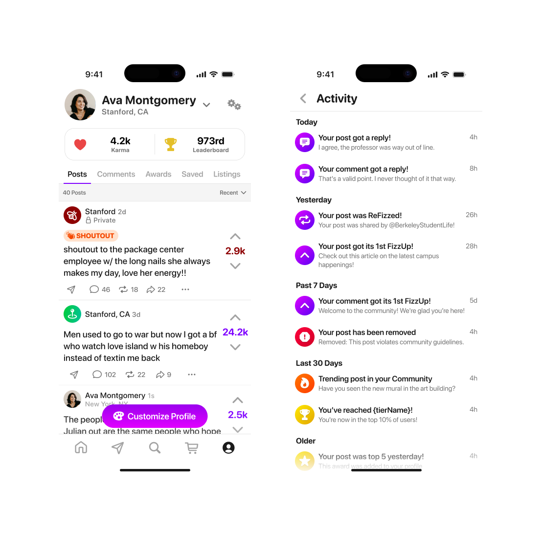
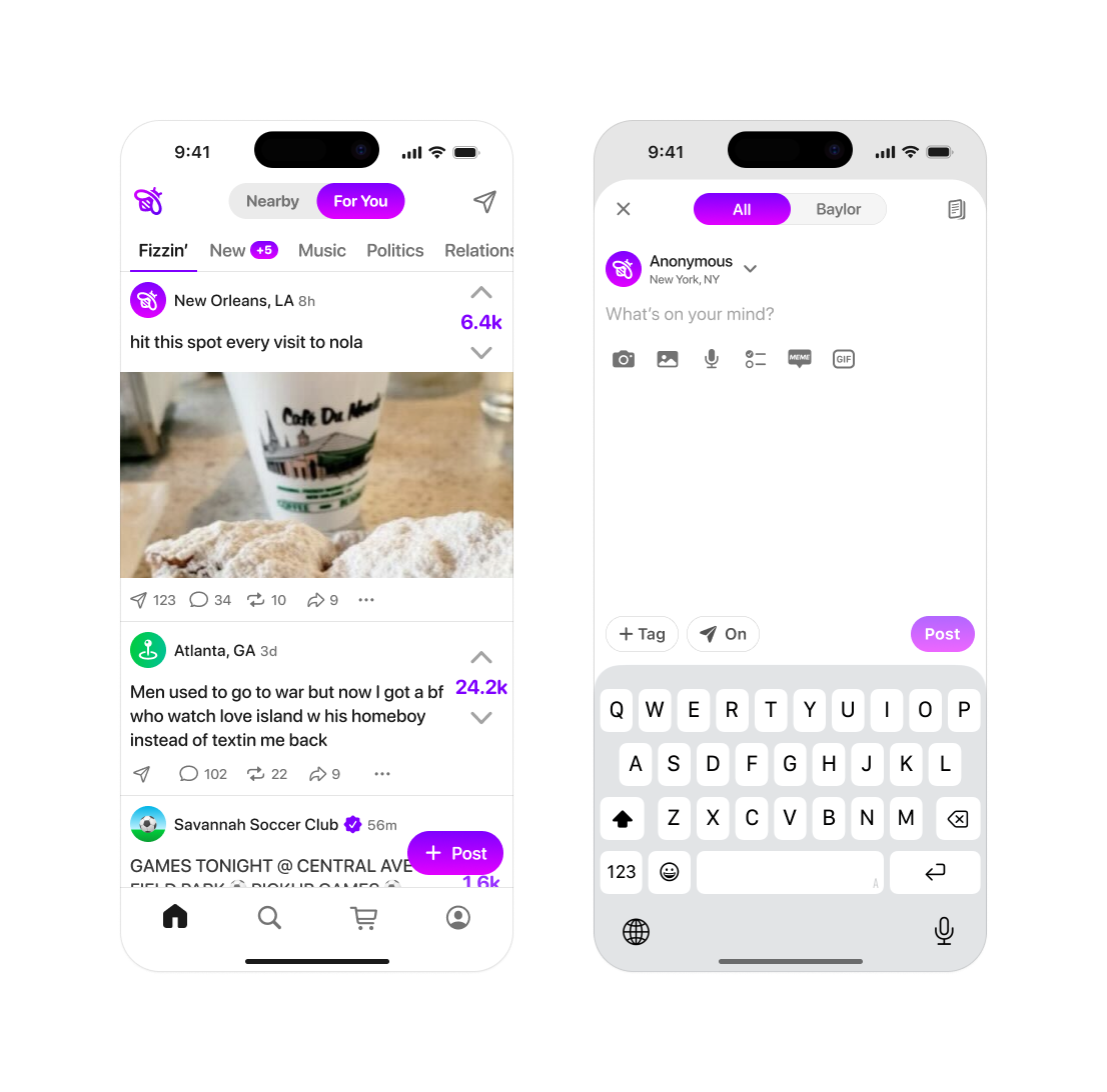
Core Navigation Improvements to Profile and Activity
Problem
Tabs were inconsistently placed, the information architecture didn't reflect how users moved through the app—especially in relation to direct messaging being hard to reach and off screen when scrolling the feed, which is one of the apps highest-engagement surfaces and a strong contributor to retention.
Approach
I audited navigation patterns and session recordings, then prototyped multiple tab architectures. Key decisions:
- –Elevate DMs to a persistent primary tab
- –Reorganized the tab bar around actual usage frequency
- –Introduced a unified "activity" hub for notifications while clearing up the mental model of the user's profile
Navigation schema before and after I joined Fizz
Outcome
DMs increased 37% from reducing friction to the feature, not from changes to the messaging product itself.
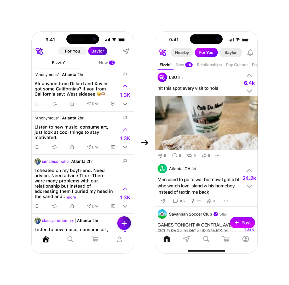
Content sharing & social proof
02Problem
Users consumed posts but rarely shared them externally. Without visible social context, like share counts and reaction aggregates, posts didn't feel worth forwarding.
Approach
I added social proof signals directly into the sharing UI: share counts, reaction aggregates, and momentum indicators. Design principles:
- –Surface real numbers in the UI, not persuasive copy
- –Signals live inside the existing share surface, not a new modal
Outcome
Content sharing increased 70%. Minimal engineering lift; shipped quickly.
Contact syncing & discovery
03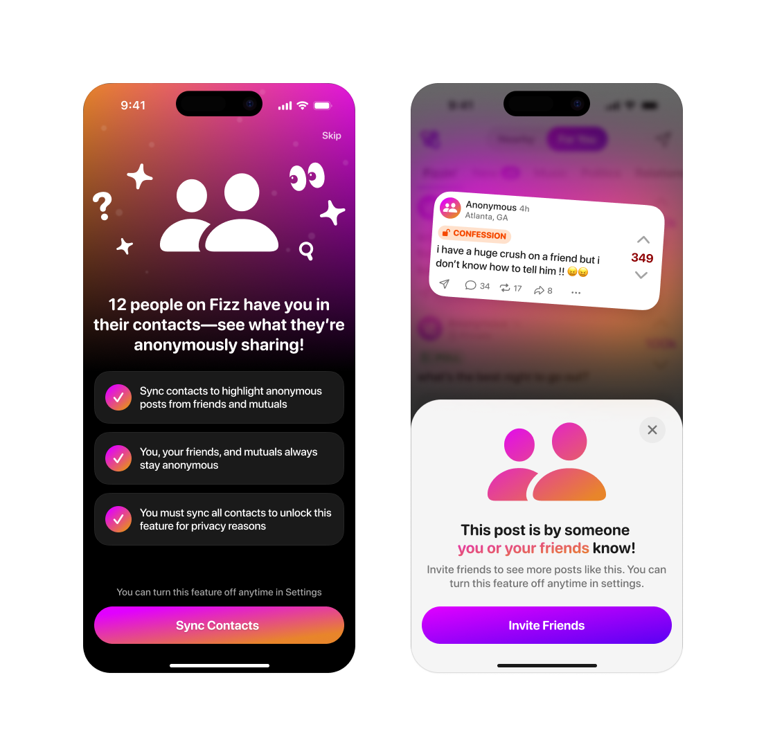
Contact Sharing and "Someone you may know" feature highlights
Problem
Two related surfaces were leaving connection on the table. Contact sharing had a 9% CTR—a feature that drove retention when used, but most users ignored the CTA entirely. And without persistent identity, users had fewer reasons to return; Fizz needed a social graph mechanism that built connection without requiring identity disclosure.
Approach
For contact sharing, the CTA was generic and didn't address perceived risk. I redesigned it with:
- –Value framing: explicit language about mutual discovery, not just what the user does
- –Trust signals: transparency about what data is and isn't shared
- –Simplified flow: fewer taps to completion, surfaced at a higher-attention moment
For social discovery, I designed SMYK ("Someone You May Know")—a personalized feature surfacing contextually relevant users via behavioral signals while preserving anonymity. Key decisions:
- –Clear language about why a suggestion was made, without exposing the underlying signal
- –Explicitly opt-in, framed as discovery rather than surveillance
- –Surfaced at natural pause points, not as an interruption
Outcome
Contact sharing CTR doubled from 9% to 22%—design changes only, no algorithmic or product changes to the underlying feature. SMYK saw 57% adoption—well above typical opt-in rates for anonymous social—and drove a 17% lift in Day 1 retention for users who opted in.
Results
04Good design decisions compound. These results reflect work that was scoped, prioritized, and iterated on with a clear hypothesis—not shipped and hoped for.
| Metric | Result |
|---|---|
| College DAU growth | +200% |
| Total MAU growth | +255% |
| Content sharing | +70% |
| Contact Sharing Rate | 9% → 22% |
| DMs Sent | +37% |
| "Someone You May Know" adoption | 57% opt-in |
| D1 retention (SMYK opt-in users) | +17% |
Rapid prototyping as the primary communication tool. Working prototypes—not decks—were how I aligned engineers and stakeholders. A testable concept surfaced implementation constraints faster than a spec document.
Data as a design partner. I treat measurement as part of the design process, not a post-launch check. Every significant decision starts with a hypothesis about what will move and why—so the outcome, whatever it is, teaches something.
System thinking at component level. Working alone across a full product required every UI decision to account for its implications elsewhere. Speed and quality are not opposites if you know which decisions are foundational and which are reversible.